MOCA WEB REDESIGN
Web design / branding
The MOCA website design project is part of a conceptual branding project I created to enhance the online to offline and the digital and physical experiences of the Los Angeles Museum of Contemporary Art.
Photo credits:
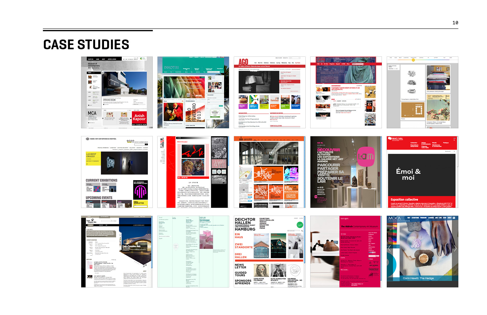
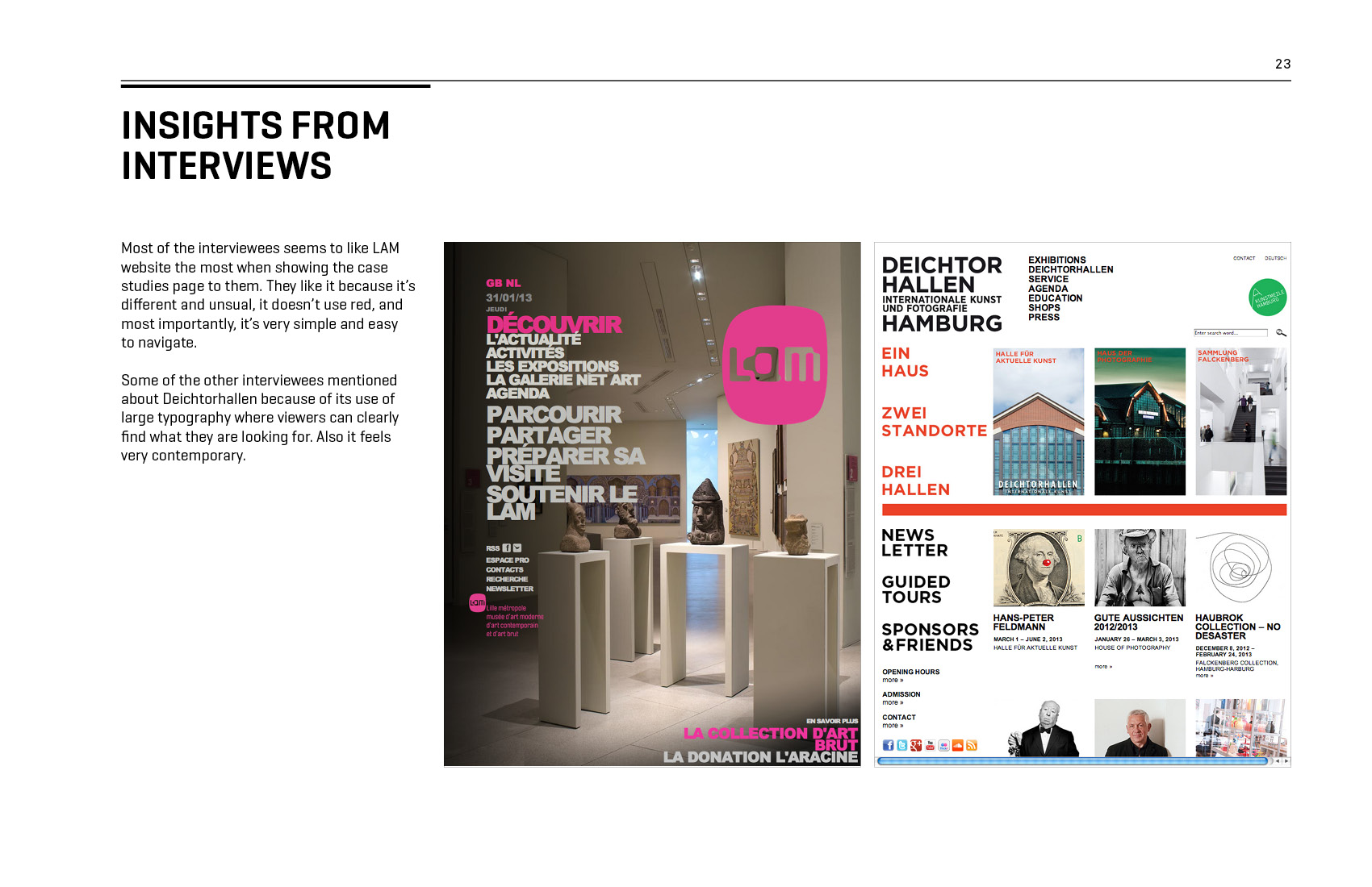
MOCA website, caiguoqiang.com, sagmeisterwalsh.com
Awards and recognition:
• Semifinalist of “Adobe Design Achievement Awards,” Adobe, 2014
—
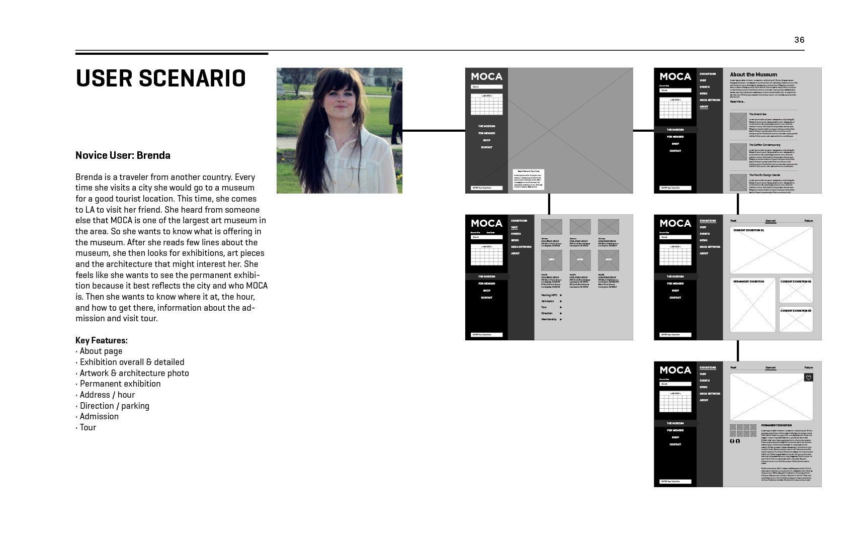
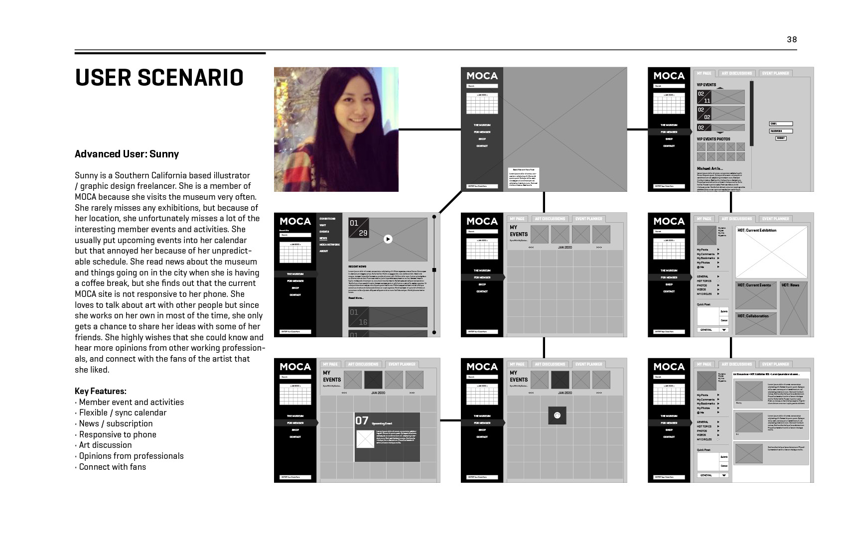
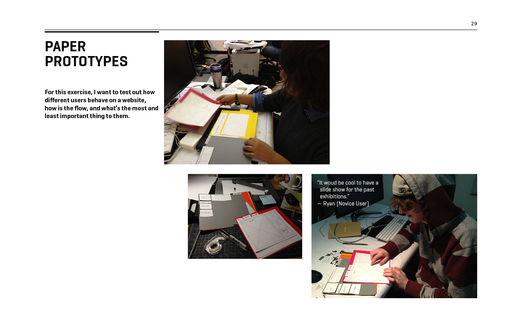
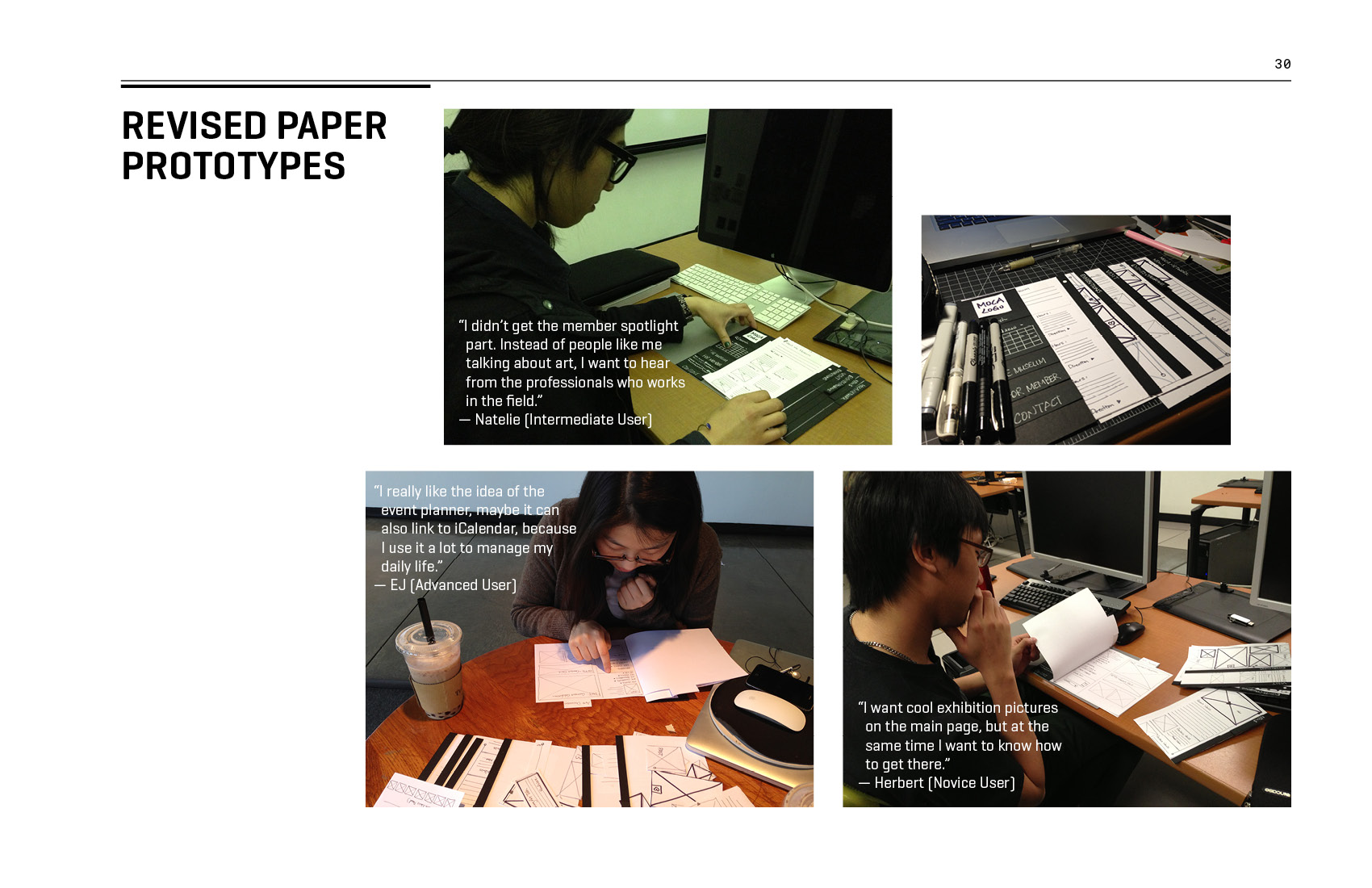
In order to appeal to both novice and advanced users, the navigations of the website have to be simple enough so that novice users with minimal computer skills and first time users can easily navigate the website and retrieve information within seconds. In addition, the website provides rich amount of contents and interactions in order to maintain a higher level of engagements for advanced users. Putting these all together, the objective is to combine a complex information architecture with a simple and straight-forward navigation, making it more appealing to different user groups.
—
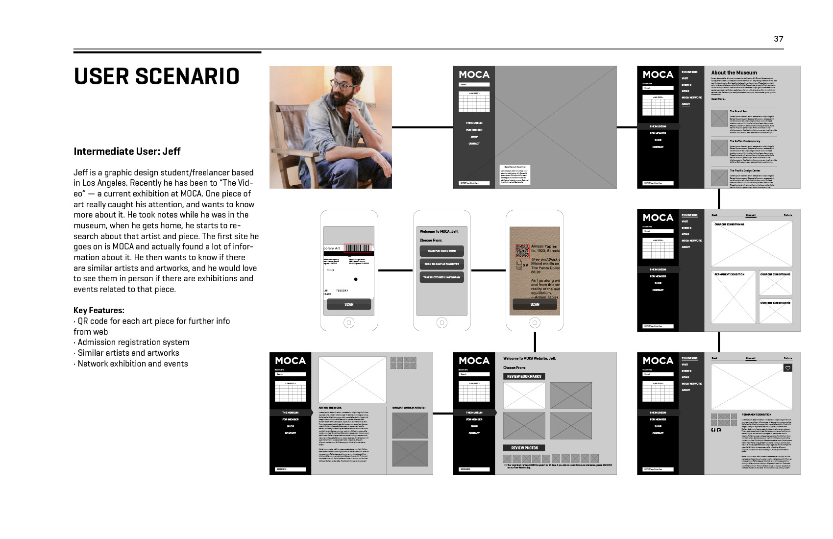
One of the concepts I came up with in this project is an offline-to-online experience to maximize the use of museum tickets. The concept is to use the barcode on each ticket as a “bookmark.” Every artwork has a barcode scanner installed nearby. Once a ticket has been scanned, the artwork will be “bookmarked” in a temporary user account associated with the barcode. Finally, if a person wants to revisit what they have bookmarked after their museum visit, they can simply go to the museum’s website and use the barcode number to retrieve the saved artworks.
Wordpress prototype


